 ICACT20220374 Slide.17
[Big slide for presentation]
[YouTube]
 |
Chrome Text-to-Speach Click!! Click!! |
 |
Thanks for your attention! Now! Floor is open for QnA. Welcome any comment or question.
|
 ICACT20220374 Slide.16
[Big slide for presentation]
[YouTube]
 |
Chrome Text-to-Speach Click!! Click!! |
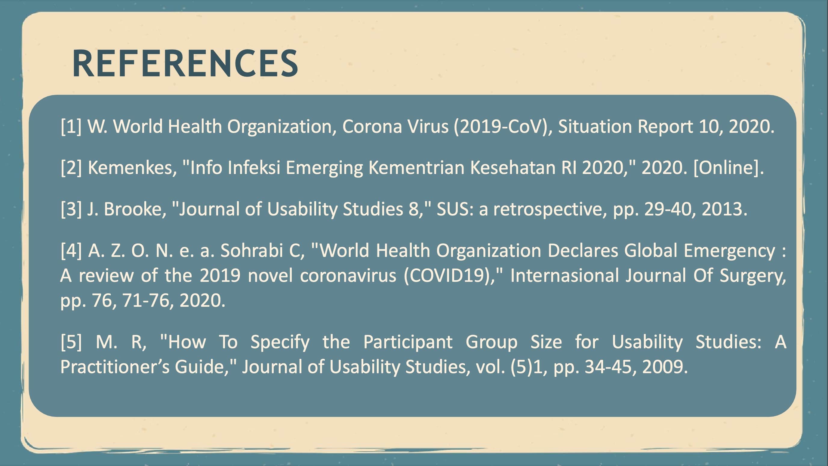 |
this is the reference for my paper.
|
 ICACT20220374 Slide.15
[Big slide for presentation]
[YouTube]
 |
Chrome Text-to-Speach Click!! Click!! |
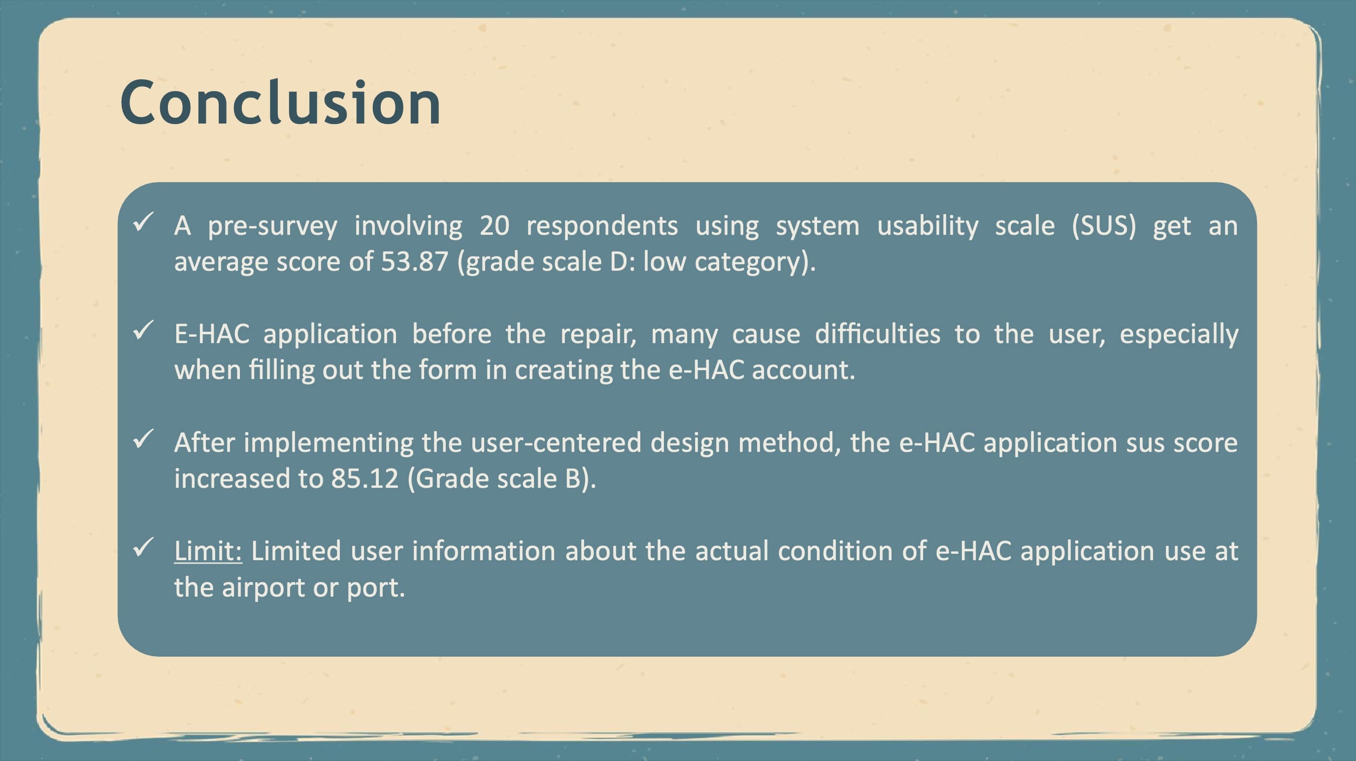 |
In the early stages, a pre-survey involving 20 respondents using system usability scale (SUS) get an average score of 53.87, which gets Grade D and Acceptability Ranges level falls into the low category. The main problem obtained from observations, interviews, and questionnaires conducted to measure usability in e-HAC applications is the layout of this application that is not neat, so it is not user friendly. E-HAC application before the repair, many cause difficulties to the user, especially when filling out the form in creating the e-HAC application. After being done using the user-centered design method, the e-HAC application has improved its usability. Re-surveyed after making improvements with the same respondents in the Pre - survey, now sus score obtained by e-HAC application increased to 85.12 from 53.87, which means acceptability ranges that were originally Low to Acceptable. Moreover, for the Grade Scale, which was originally D into category B.
Although the usability results in e-HAC applications obtained in this study have improved, they are still not perfect and can be improved for future research. Additionally, due to the limited information from users who need further research, especially on observation to see the actual condition of using e-HAC application at the airport or port. Therefore, further evaluation and improvement is needed so that the score obtained can get the highest score in each category.
|
 ICACT20220374 Slide.14
[Big slide for presentation]
[YouTube]
 |
Chrome Text-to-Speach Click!! Click!! |
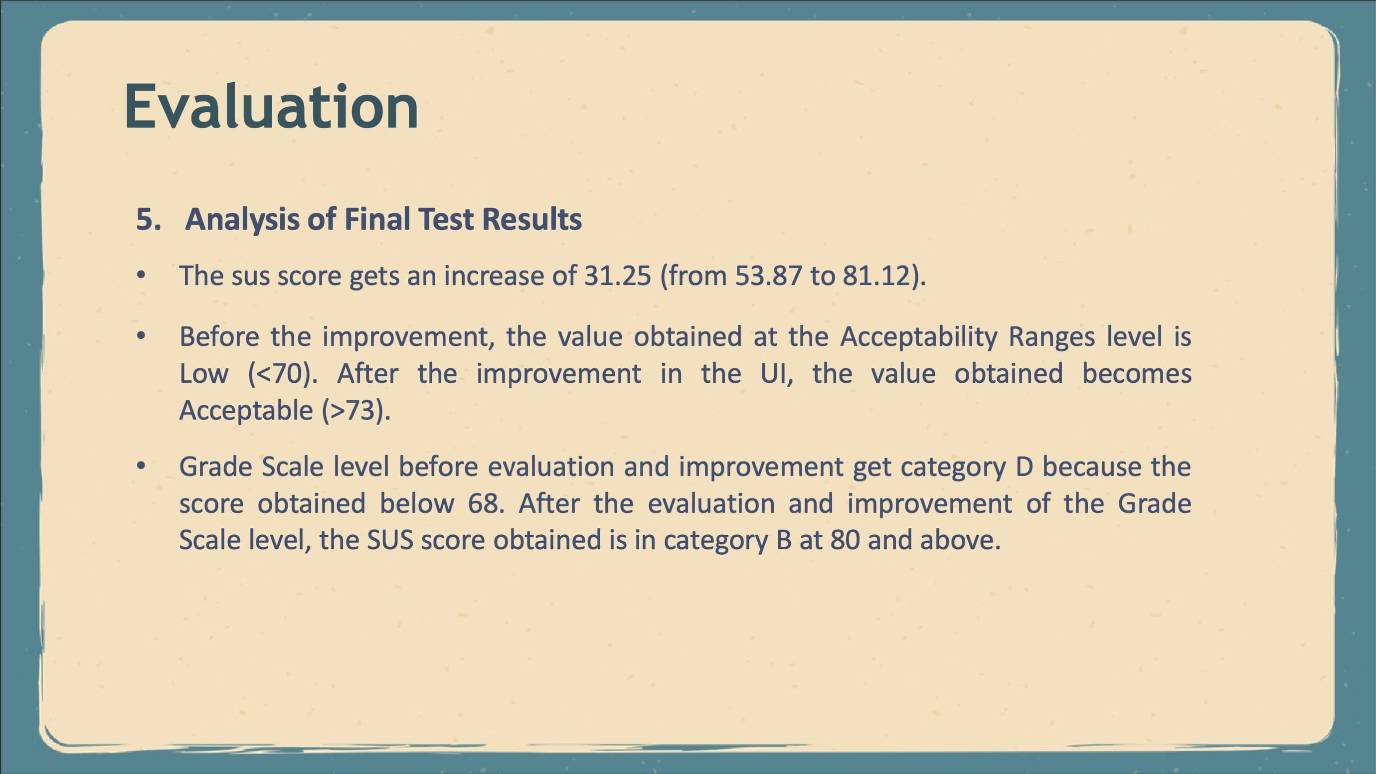 |
Based on the Pre - survey and final survey results conducted after making improvements using the UCD method. It can be seen that sus score gets an increase of 31.25, which is the initial survey result of 53.87, and the final survey result gets a score of 85.12. In the Pre - survey stage, where before the improvement, the value obtained at the Acceptability Ranges level is Low because the score obtained is below 70. After the final evaluation and improvement in the UI in this e-HAC application, the value obtained becomes Acceptable because the score obtained is above 73. Grade Scale level before evaluation and improvement get category D because the score obtained below 68. After the evaluation and improvement of the Grade Scale level, the SUS score obtained is in category B at 80 and above.
|
 ICACT20220374 Slide.13
[Big slide for presentation]
[YouTube]
 |
Chrome Text-to-Speach Click!! Click!! |
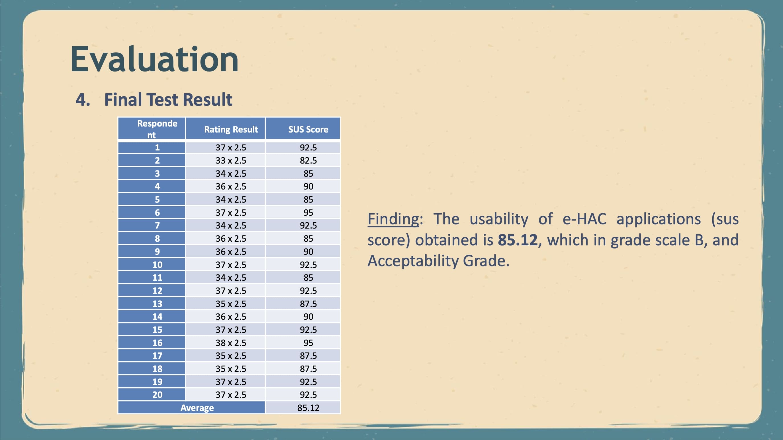 |
The test result stage is the same as Pre - the initial survey conducted using the System Usability Scale (SUS) questionnaire. This SUS questionnaire will be distributed to 20 respondents who are the same as the initial Pre -survey respondents. Before completing the SUS questionnaire, respondents must test the prototype e- HAC application developed using the User-Centered Design (UCD) method.
Based on the results of the final usability test conducted after making improvements, it can be seen that the sus score obtained is 85.12, which includes Grade B and Acceptability Grade, which is Acceptable.
|
 ICACT20220374 Slide.12
[Big slide for presentation]
[YouTube]
 |
Chrome Text-to-Speach Click!! Click!! |
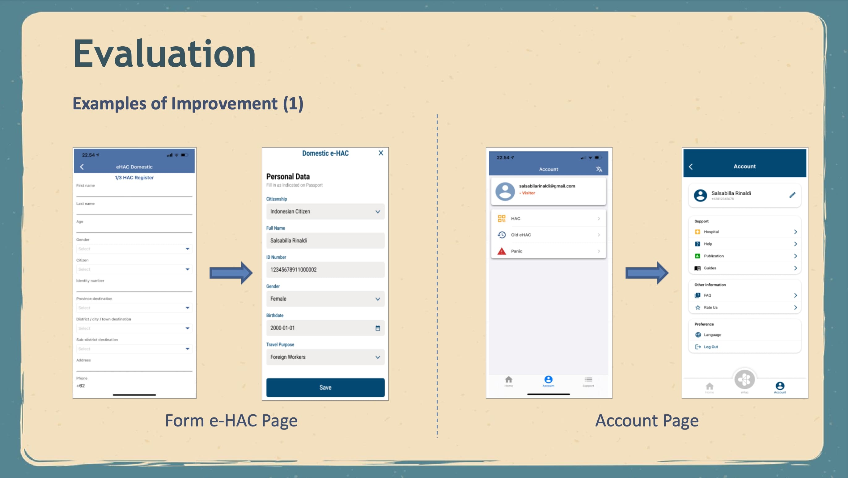 |
3. Form e-HAC Page, Filling out the form on the e-HAC form filling page is simplified, with each information converted into several steps. Furthermore, a scan feature for the mode of transportation can make it easier for users to fill out forms so that they do not have to fill them out manually one by one. Then, add some other information, such as health information, so that this application is effective and can track each user effectively to reduce the spread of the Covid-19.
4. Account Page, In the previous UI Design, the profile page contains the e-HAC form and eHAC history. The users can only view their email and change their password on the profile page, so this page is not functional enough because the users cannot see personal information. Therefore, changes were made to the profile page to improve the usability of this application and provide some assistance and information in order to complete this e-HAC application
|
 ICACT20220374 Slide.11
[Big slide for presentation]
[YouTube]
 |
Chrome Text-to-Speach Click!! Click!! |
 |
After conducting Pre - survey and getting a SUS score, it can be seen that the result of the SUS score obtained is still relatively low because it is still in the “Low” category. Therefore, we make design changes according to the feedback that has been given by the previous respondents which is to ease the use of the e-HAC application.
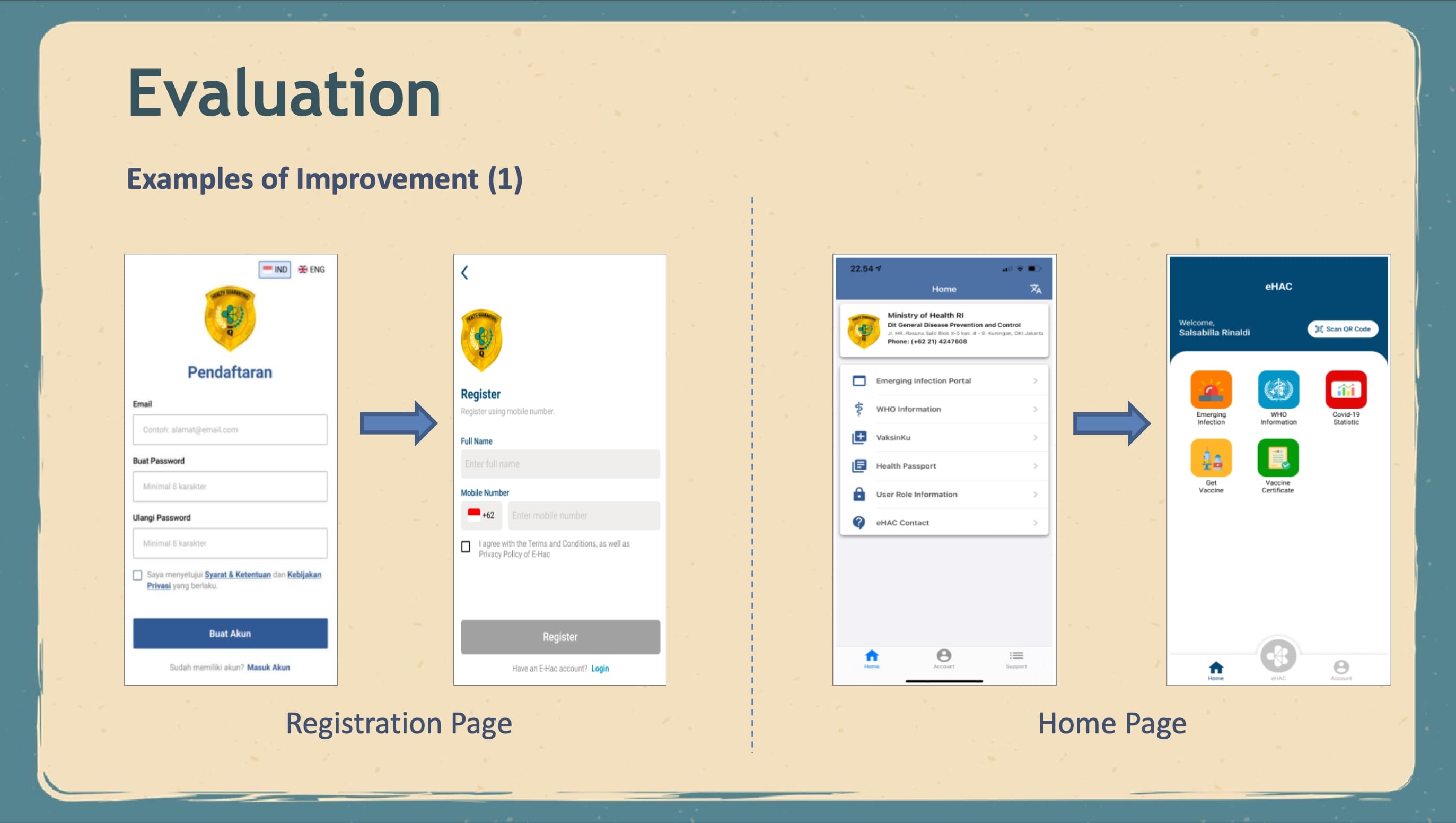
here are some main pages that have been updated by using UCD:
1. Registration Page, Several changes were made to user information on the registration page, which initially only used email and passwords, was changed to some more detailed personal information such as phone numbers and verification numbers that will be sent to each user to increase their security.
2. Homepage, On this main page, significant changes will be made to improve the usability of eHAC application users. The UI Design on the main page of this application will be changed to make it more aesthetic and comfortable for users to see, and put the main features on the navbar to make it easy to see and make it easier for users to fill out e-HAC forms.
|
 ICACT20220374 Slide.10
[Big slide for presentation]
[YouTube]
 |
Chrome Text-to-Speach Click!! Click!! |
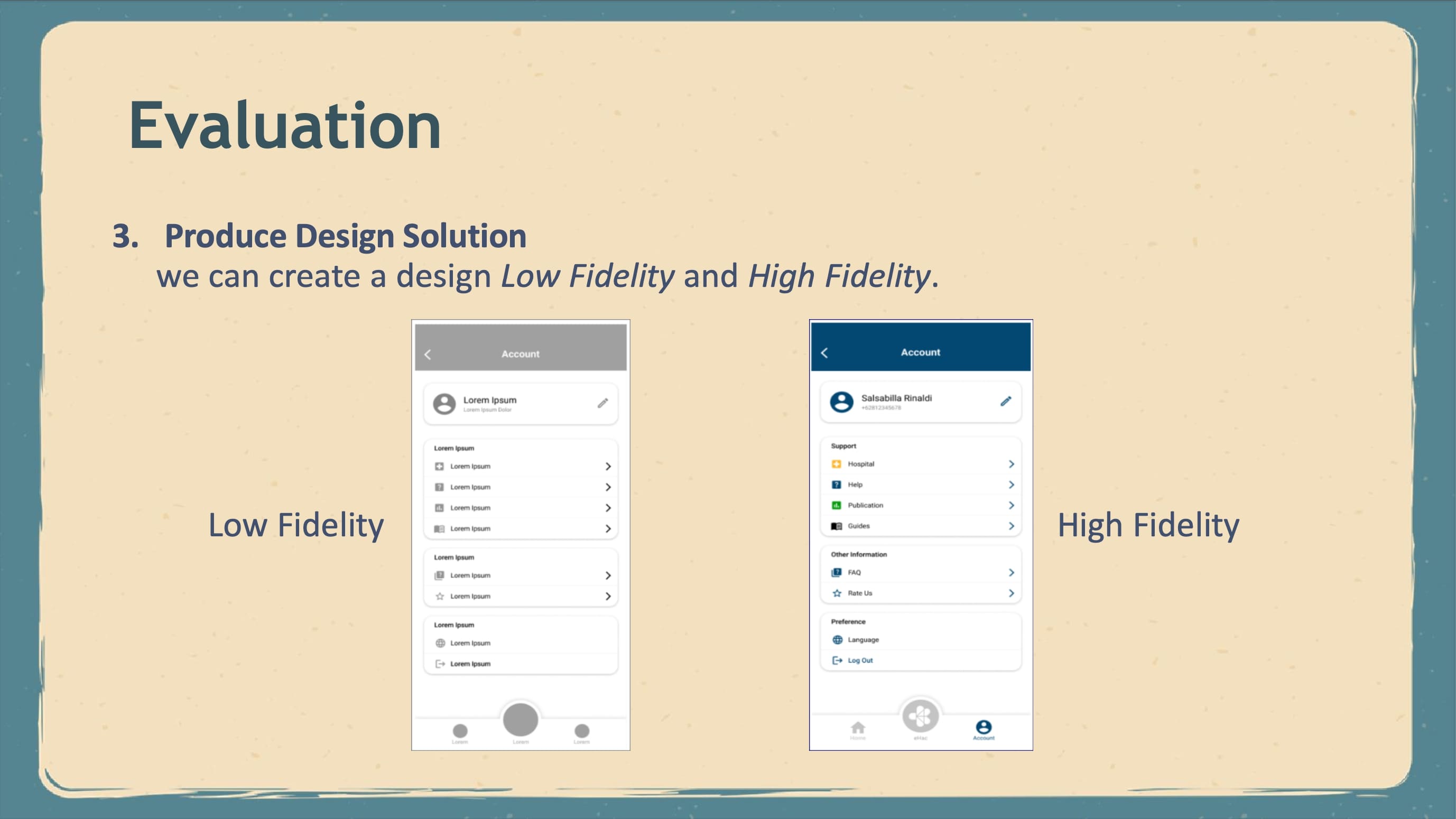 |
At this stage, after completing the previous stages, we can create a design solution that will be built to improve usability in this e-HAC application.
and this is the example of Low Fidelity and High Fidelity.
|
 ICACT20220374 Slide.09
[Big slide for presentation]
[YouTube]
 |
Chrome Text-to-Speach Click!! Click!! |
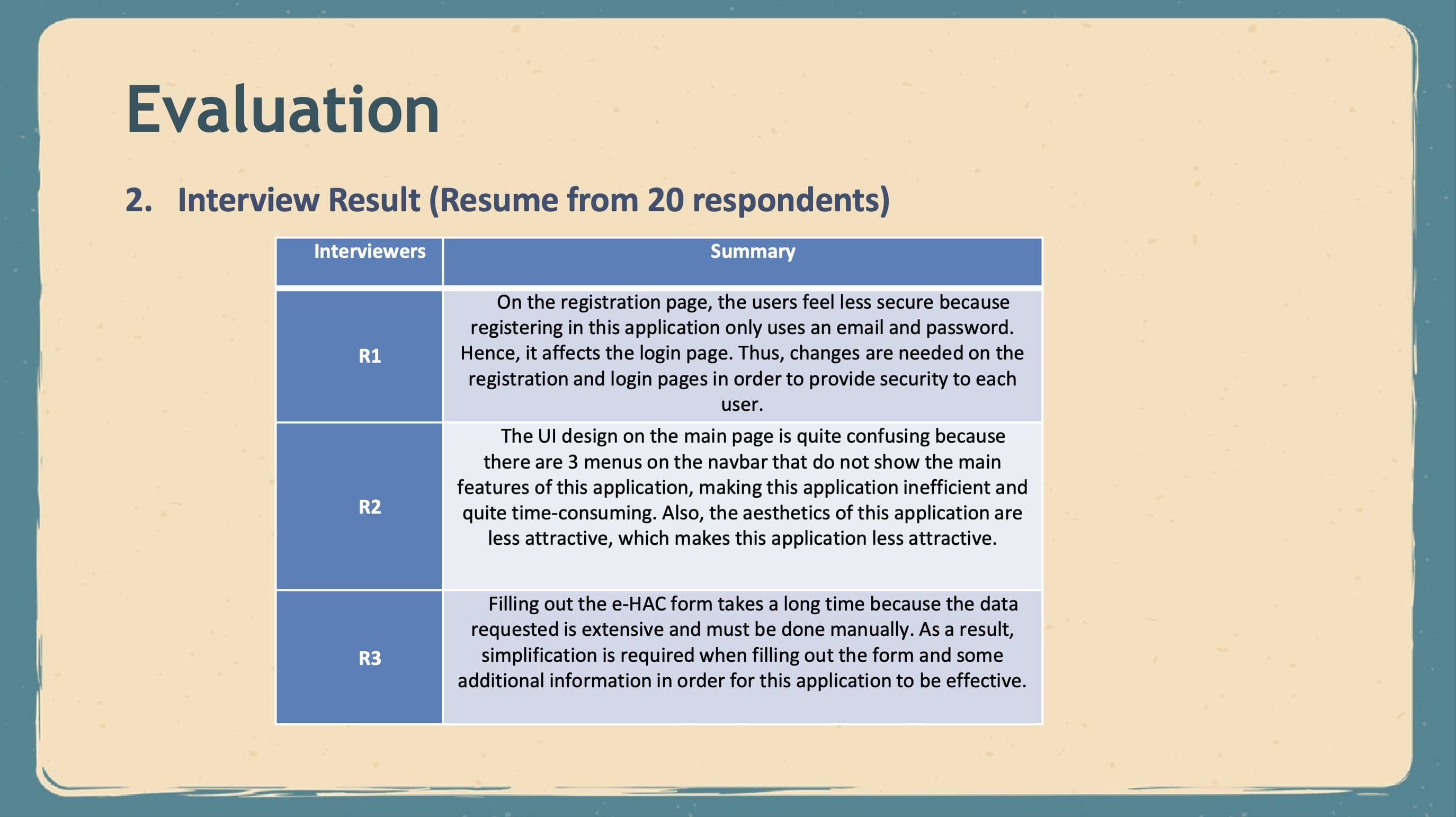 |
The group of users of e- HAC application is people who travel domestically using air transportation and water transportation. also The specification stage of user needs is done using the interview method with three users chosen from 20 respondents at the initial evaluation stage, considering that they feel the constraints when using the e-HAC application.
and this is the interview result from 3 respondent. we can get the new idea from this summary interview to make the good improvement based on user's want.
|
 ICACT20220374 Slide.08
[Big slide for presentation]
[YouTube]
 |
Chrome Text-to-Speach Click!! Click!! |
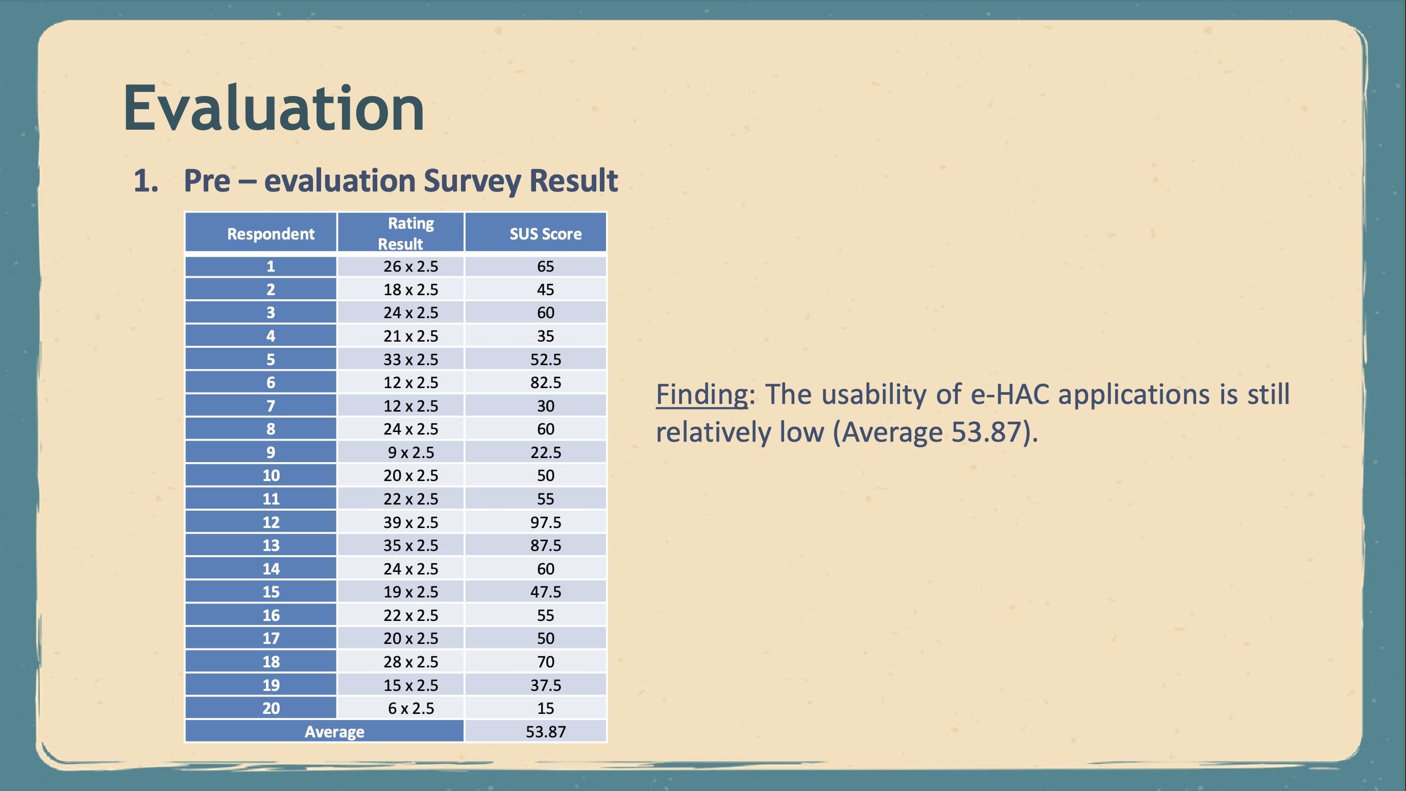 |
At the initial test result stage, a questionnaire using SUS was given to 20 respondents who had used the e-HAC application on the IOS platform. From the initial evaluation results obtained the following results :
Based on the results obtained, the usability of e-HAC applications is still relatively low and needs to be improved. Then, improvisation will be done using the User-Centered Design method to fulfill the user's wishes.
|
 ICACT20220374 Slide.07
[Big slide for presentation]
[YouTube]
 |
Chrome Text-to-Speach Click!! Click!! |
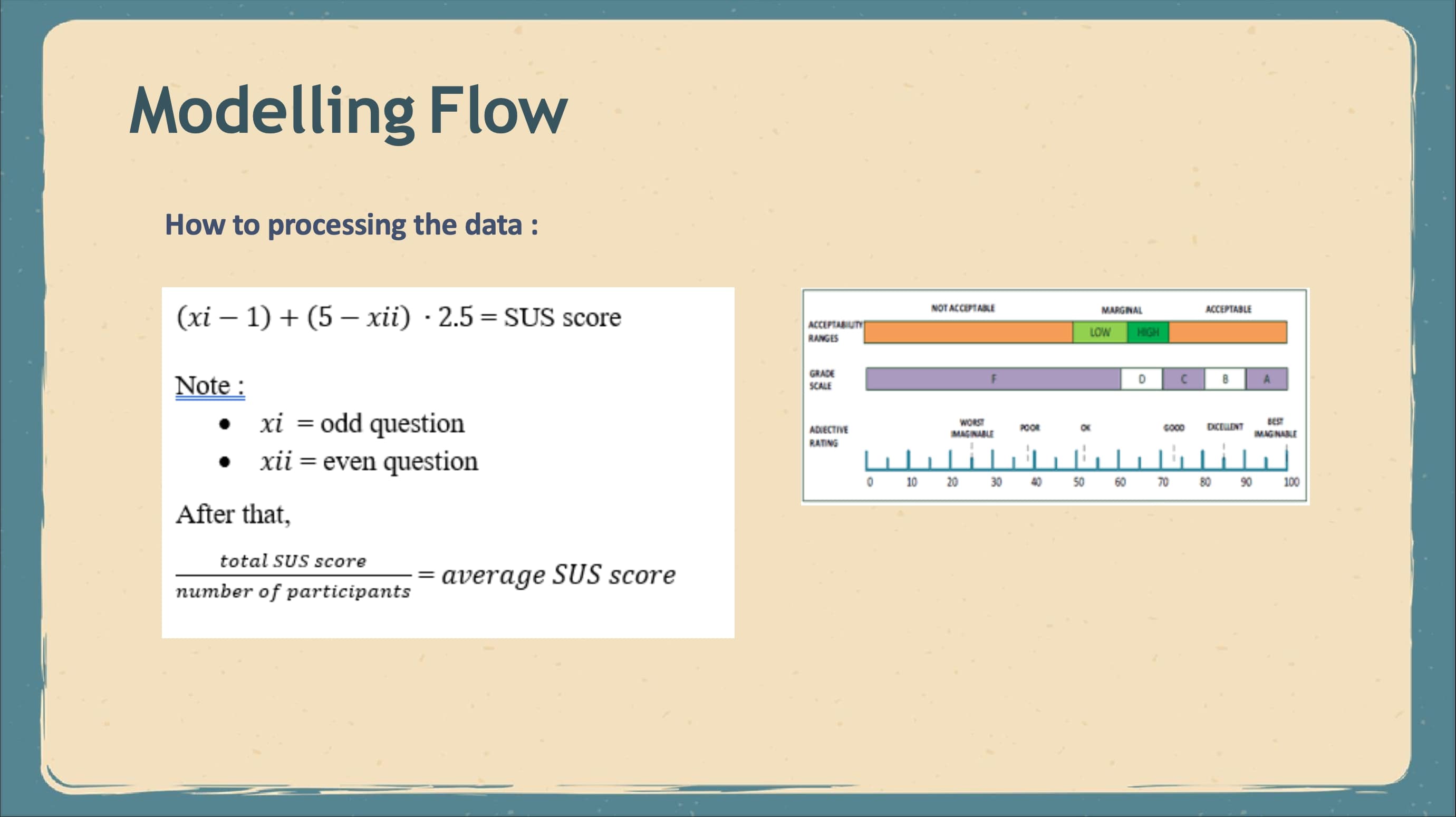 |
and this is how to processing the data and after we got the average SUS score, we can see the acceptable ranges and grade scale for our design.
|
 ICACT20220374 Slide.06
[Big slide for presentation]
[YouTube]
 |
Chrome Text-to-Speach Click!! Click!! |
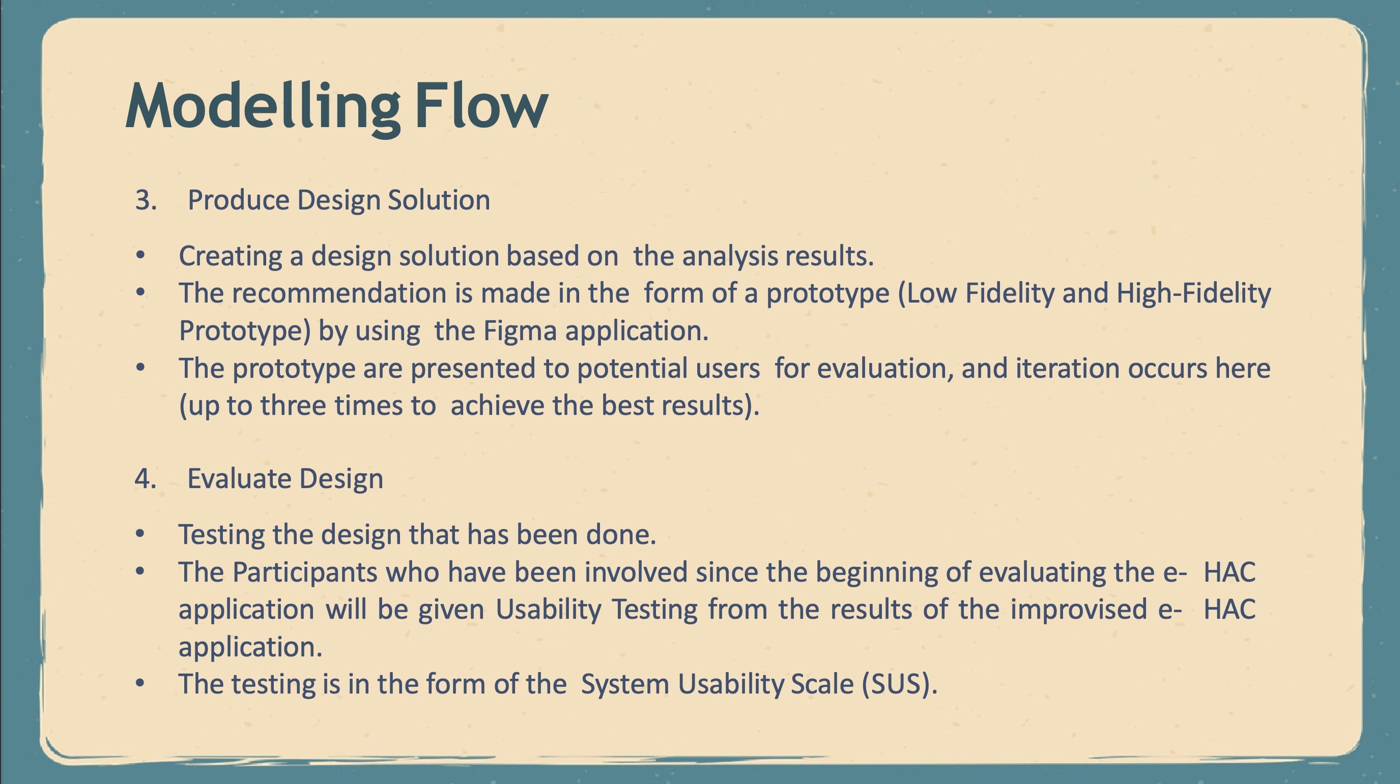 |
- three, produce design solution.
In this Produce Design Solution stage, the author will create a design solution based on the analysis results that we have done previously. After identifying usability issues, recommendations for improvement are made. This recommendation is made in the form of a prototype where the author will create Low Fidelity in the form of wireframes and mockups. After that, the author will create a High-Fidelity Prototype created using the Figma application. After completing the flow design solution, the findings are presented to potential users for evaluation, and iteration occurs here. An iteration might occur up to three times to achieve the best results. Repair is a priority, as it is a significant part of the application.The prototype demonstrates the difference between before and after the iteration process.
- four, Evaluate Design
At this Design Evaluation stage, the writer will test the design that has been done. Based on the method used, the User-Centered Design is user-centered for each process. Participants who have been involved since the beginning of evaluating the e- HAC application will be given Usability Testing from the results of the improvised e- HAC application by using the Usability Testing technique, namely in the form of the System Usability Scale (SUS), so that they can feel the difference from the e-HAC application before and after improvisation.
|
 ICACT20220374 Slide.05
[Big slide for presentation]
[YouTube]
 |
Chrome Text-to-Speach Click!! Click!! |
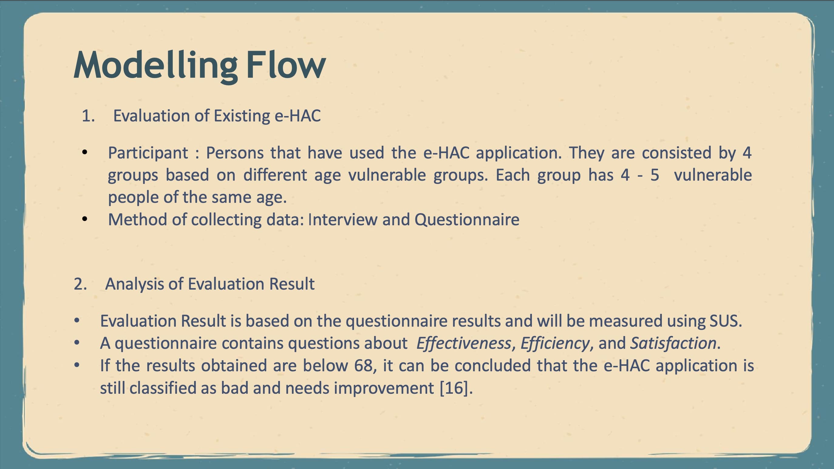 |
- one, evaluate existing of eHAC.
the Participant In this study, based on the User-Centered Design method at the Plan the Human-Centered Design stage, the involved participants have used the e-HAC application since they can provide more accurate input based on their experiences. Participants in this study consisted of 4 groups based on different age vulnerable groups. Each group has 4 - 5 vulnerable people of the same age. and for the Method of collecting data is Interview and Questionnaire.
- two, analysis of the evaluation result.
At this stage, the writer will conduct an analysis and see the results of the evaluation that has been done previously. The author identifies people who use the e-HAC application. This will explain what for and under what conditions they want to use this e-HAC application and in accordance with the User-Centered Design concept at the Specify the Context of Use stage.
We will evaluate it from the questionnaire results distributed to several respondents, which will be measured using SUS. A questionnaire contains questions about Effectiveness, Efficiency, and Satisfaction where we can see the results of each respondent's scores and calculate the average of the results of these scores so that we will get the results of the evaluation of the current e-HAC application. According to [16], If the results obtained are below 68, it can be concluded that the e-HAC application is still classified as bad and needs improvement.
|
 ICACT20220374 Slide.04
[Big slide for presentation]
[YouTube]
 |
Chrome Text-to-Speach Click!! Click!! |
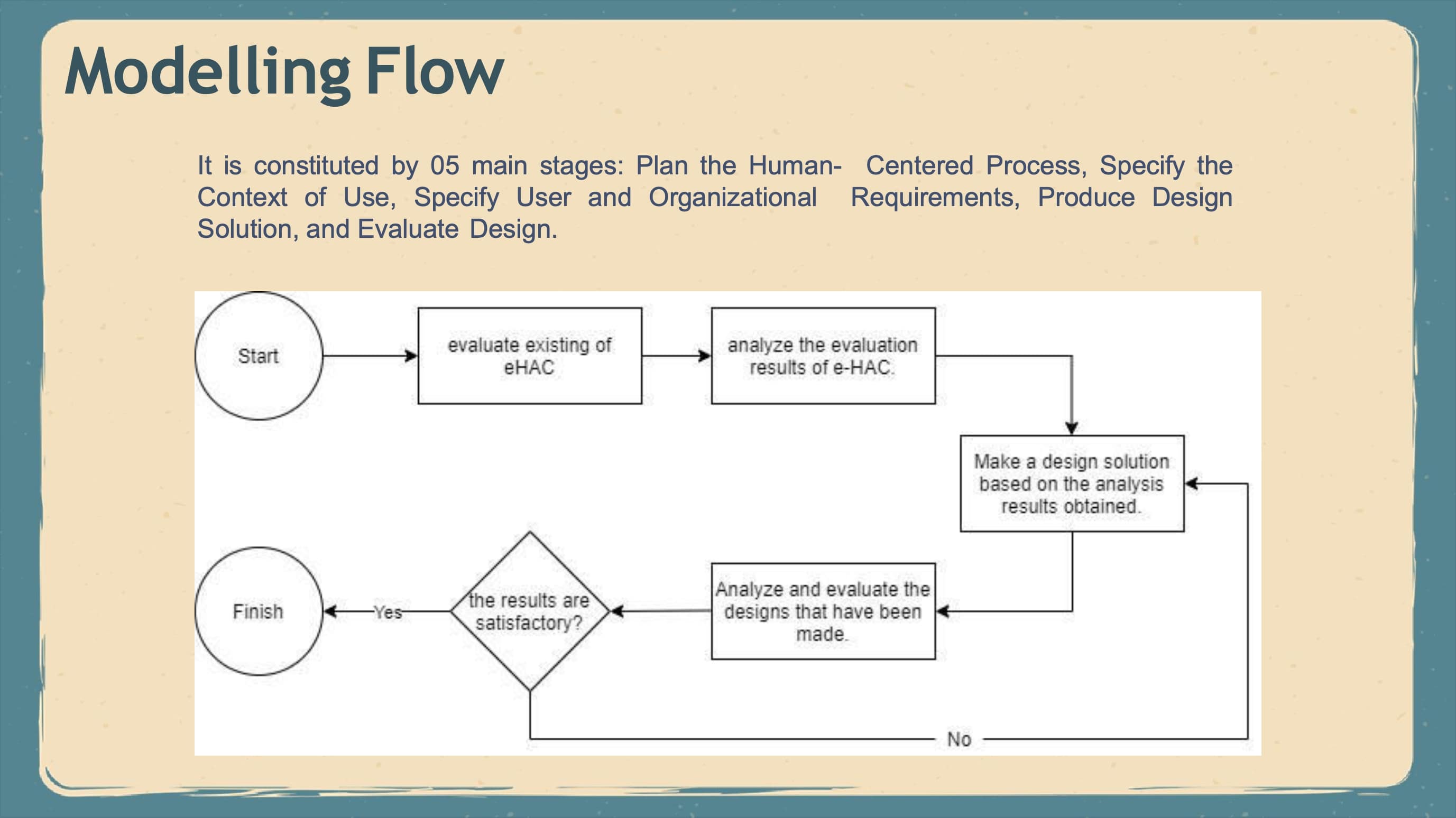 |
this is the modelling flow in this paper. because i use User Centered Design method to make improvement. we have 5 main stages in here. Plan the Human- Centered Process, Specify the Context of Use, Specify User and Organizational Requirements, Produce Design Solution, and Evaluate Design. i will explain one by one the modelling flow.
|
 ICACT20220374 Slide.03
[Big slide for presentation]
[YouTube]
 |
Chrome Text-to-Speach Click!! Click!! |
 |
Design interface using the UCD method, by focusing on the primary needs of the user. Design Interface System Cross Information School, the library is designed with Online Union Catalog, Maintenance Master Data Library Members, Registry Transactions of Borrowing. User Access Rights Settings Information Systems, and Recommendations Collection based on User Behavior.
it can be concluded that the existing problems can be resolved with design rules. The interface design is carried out using the User- Centered Design (UCD) method by focusing on the primary needs of the user.
Additionally, the Titip Masa website has a usability value of 64.5, which is at grade C. After the repairs were made, it increased to 82.5 and was in grade A based on the system usability scale (SUS) score.
|
 ICACT20220374 Slide.02
[Big slide for presentation]
[YouTube]
 |
Chrome Text-to-Speach Click!! Click!! |
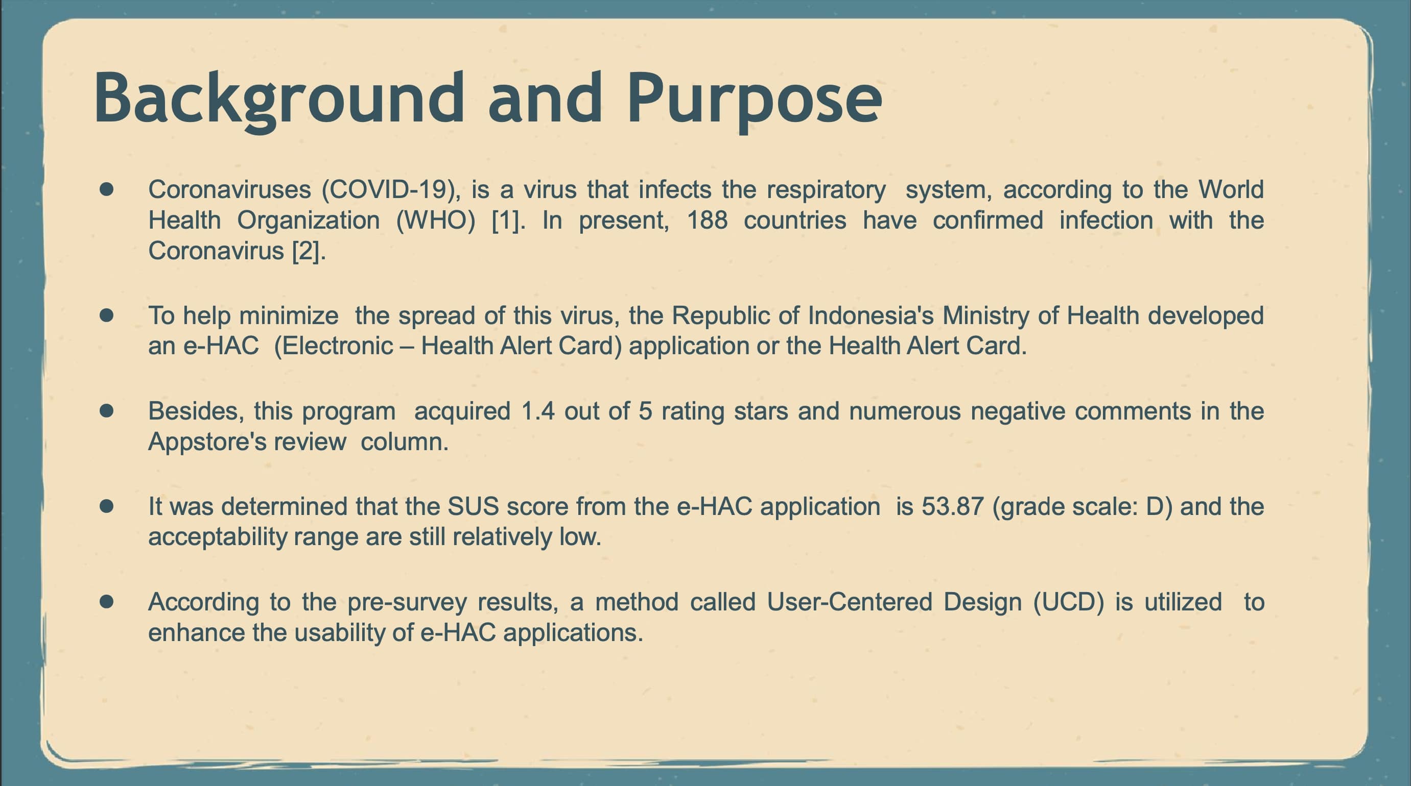 |
in this slide i want to explain the background about my paper. as we know corona virus is a new virus in our world and This virus has spread to almost 188 countries. in Indonesia to minimize the spread of this virus the Republic of Indonesia's Ministry of Health developed an e-HAC(Electronic – Health Alert Card) application or the Health Alert Card. This application is for all domestic and international travelers during this pandemic. But, this application only got 1.4 out of 5 rating stars and numerous negative comments in the Appstore's review column. To validate the e-HAC application's problems, a Pre-Survey of users was conducted using questionnaires and interviews.
After completing the calculations, it was determined that the SUS score from the e-HAC application is 53.87, indicating that the grade D scale and acceptability range are still relatively low. Then, interviews with four persons of various ages were undertaken to elicit more information about the eHAC application's usability. According to the findings of interviews, this application still has several shortcomings.
According to the pre-survey results, it is necessary to enhance several of the existing User
Interfaces in the e-HAC application. Thus, a method called User-Centered Design (UCD) is utilized to enhance the usability of e-HAC applications. The User-Centered Design (UCD) method is the
most widely used method since it incorporates users in the research process and allows for enhancements to the e-HAC application's User Interface based on user feedback
|
 ICACT20220374 Slide.01
[Big slide for presentation]
[YouTube]
 |
Chrome Text-to-Speach Click!! Click!! |
 |
Hi everybody, my name is Salsabilla Rinaldi for Telkom University, Indonesia. i have cooperated with my two lectures from my University. Mr Arfive Gandhi and Mr Nungki Selviandro. Our presentation today is about e-HAC application from Indonesia. and the tittle for my presentation is Usability Evaluation and Recommendation of User Interface Design for eHAC Application by using User-Centered Design Method.
|


