 |
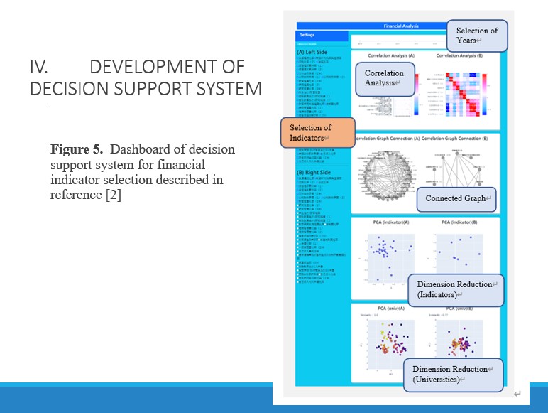
Figure 5 shows an example of our dashboard of decision support for indicator selection in [2].
Left side of the figure is the indicator selection panel of financial indicators for comparison of two situations of indicator selection.
Top side of the figure is the selection panel of fiscal year.
Right side consists of several data analysis reports.
We explain from top to bottom: Correlation analysis with Heat maps, correlation analysis by Connecting Graphs, dimension reduction for indicators by Principal Component Analysis (PCA), dimension reduction for universities by PCA with similarity degree.
These analysis reports show more detailed information by mouse-hover operation. All these reports are connected to indicator selection and year selection. Change of the result are responded instantly.
Two analysis results (Left and Right in the figure) are provided as comparison to the user or experts of this field while repeating trial and error (exploratory way). Consequently, they can reach the final decision of financial indicator selection.
|
 IEEE/ICACT20230139 Slide.15
[Big Slide]
IEEE/ICACT20230139 Slide.15
[Big Slide]