 |
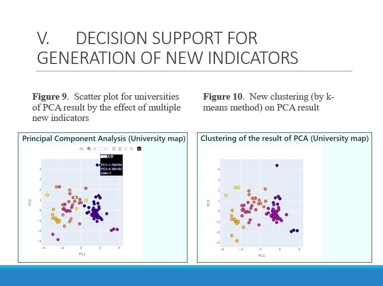
Figure 9 is a scatter plot of universities of the result of PCA.
In the figure, each color represents the conventional class of universities.
The tendency of the allocation of points is similar by other dimension reduction methods such as Isomap.
We execute some kinds of clustering methods (k-means and so on) on the dimension reduction space and visualize the clustering results.
Figure 10 shows the results of clustering (k-means) for the university scatter plot of Figure 9.
Different colors in the figure represent different clusters. The number of clusters can be varied depending on the situation.
|
 IEEE/ICACT20230139 Slide.21
[Big Slide]
IEEE/ICACT20230139 Slide.21
[Big Slide]